

TL;DR:
- The Vanta logo emphasizes trust through a deep Indigo Ink color, a serif typeface, and a purple llama mascot named Ilma. Its minimalist, flat design and restrained use of color differentiate it from typical SaaS security branding. The visual identity unites authority and approachability, reinforcing Vanta’s core message of security and reliability.
The Vanta logo is defined by a deep Indigo Ink wordmark, a serif display typeface, and a purple llama mascot named Ilma. Together, these three elements form a visual identity built to communicate trust and security for a platform that handles SOC 2, ISO 27001, and other compliance frameworks. Vanta's branding is not decorative. It is a strategic trust engine designed to translate complex security narratives into a single, memorable mark. For designers and branding professionals studying how enterprise SaaS brands earn credibility at a glance, the Vanta visual identity is one of the most instructive examples in the market.
What are the key design elements of the Vanta logo?
The Vanta logo is anchored by a single, precisely defined color: Indigo Ink (#260048). This deep purple is applied to the wordmark, decorative icon fills, and strong border accents across every brand surface. The consistency of that one color creates immediate recognition without relying on gradients or complex color mixing.
The typeface is equally deliberate. The wordmark and all primary headlines use Reckless serif, set at 24px weight 500. Reckless is a contemporary serif with warmth and authority. It reads as premium without feeling stiff or corporate. For all UI surfaces and functional text, Vanta switches to Inter Variable, a neutral grotesque that prioritizes readability over personality.
The layout philosophy completes the picture. Vanta's design system uses a flat, architectural style with 1px hairline borders in near-black (#181822) instead of drop shadows. No gradients. No depth effects. The result looks like a printed compliance report, which is exactly the association the brand wants to create.
Key design elements of the Vanta logo and visual system:
- Primary color: Indigo Ink (#260048) for the wordmark, icons, and borders
- Accent color: Vivid Violet (#5e05c4), reserved for primary calls-to-action and active navigation text
- Hero wash: Lavender (#ddd6ff) used as a background tone for hero sections
- Headline typeface: Reckless serif for warmth and authority
- UI typeface: Inter Variable for clarity and function
- Border style: 1px hairline borders, no shadows, flat layout
Pro Tip: When building a brand system inspired by Vanta's approach, lock your primary color in hex before touching any other design decision. Every other choice, from typography weight to border thickness, should serve that anchor color.
What is the symbolism behind Ilma, the Vanta mascot?
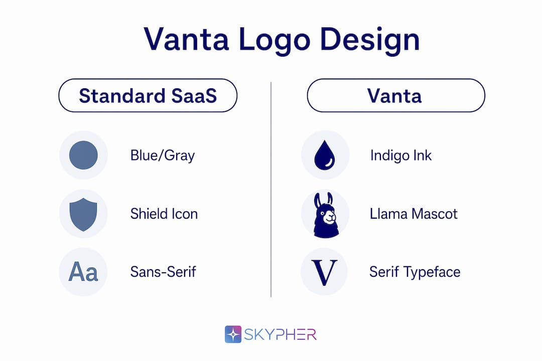
Vanta's mascot is a purple llama named Ilma, and the choice of animal is not arbitrary. The name Ilma means "resolute protector" in German), which maps directly onto Vanta's core product promise: protecting organizations from compliance risk. Llamas are also known for their alertness, intelligence, and use as guard animals for livestock. That real-world behavior makes the mascot a genuine metaphor, not just a cute character.

The mascot strategy solves a real branding problem. Security and compliance software is inherently serious. Audit reports, risk frameworks, and vendor assessments do not invite warmth. A mascot like Ilma humanizes complex technical concepts) without undermining the brand's authority. The llama is purple, matching the Indigo Ink palette, which keeps the character visually integrated rather than feeling like a separate campaign asset.
What Ilma achieves in the Vanta brand system:
- Memorability: A llama is unexpected in enterprise software. That surprise creates recall.
- Trust signaling: The "resolute protector" meaning reinforces the product's security promise.
- Approachability: The mascot softens the brand for buyers who find compliance intimidating.
- Visual cohesion: The purple color ties Ilma directly to the Indigo Ink palette.
- Differentiation: Most security SaaS brands use shields, locks, or abstract geometric marks. A llama stands apart immediately.
The juxtaposition of a serious purple palette with a quirky protective mascot) creates a duality that few enterprise brands achieve. Ilma appears alongside the wordmark in marketing materials, onboarding flows, and social content, keeping the character active rather than decorative.
How does Vanta's visual identity stand apart in SaaS security branding?
Most SaaS security brands follow a predictable visual grammar: blue or gray color palettes, shield iconography, drop shadows for depth, and a sans-serif wordmark that reads as "safe" and "corporate." Vanta rejects all of these conventions. The result is a brand that reads as premium and authoritative without looking like every other vendor in the space.
The lavender hero wash (#ddd6ff) is a particularly sharp choice. Lavender is calm and approachable, but it is also unusual in a category dominated by dark blues and grays. It creates visual contrast on a page without demanding attention the way a saturated color would. The Vivid Violet (#5e05c4) accent color then punctuates the system selectively, appearing only on primary calls-to-action and active navigation states. That restraint is what makes the accent feel meaningful when it appears.
| Design element | Typical SaaS security brand | Vanta's approach |
|---|---|---|
| Primary color | Navy blue or dark gray | Indigo Ink (#260048) |
| Background tone | White or light gray | Lavender hero wash (#ddd6ff) |
| Depth effects | Drop shadows, gradients | 1px hairline borders, flat layout |
| Mascot or character | Rarely used | Ilma the purple llama |
| Headline typeface | Sans-serif | Reckless serif |
| Accent color usage | Broad, multi-color | Single Vivid Violet, used sparingly |
Vanta's brand identity functions as a strategic asset, not a visual afterthought. The company hires designers with strong typographic and compositional skills specifically to translate trust narratives into lasting visuals. That internal investment shows in the coherence of the system.
Pro Tip: Restraint is the hardest design decision to defend in a stakeholder meeting. Vanta's single accent color rule is a useful precedent to cite when pushing back against requests to "add more color" to a brand system.
How can designers create logos inspired by the Vanta approach?
Vanta's visual identity offers a clear framework for any brand that needs to communicate trust, especially in compliance, security, or financial services. The principles are transferable. Here is how to apply them.
-
Choose a signature base color and commit to it. Vanta's entire system flows from Indigo Ink (#260048). Pick one color that carries the brand's core meaning, whether that is authority, calm, or precision, and use it consistently across the wordmark, icons, and borders. Resist the urge to build a multi-color primary palette.
-
Split your typeface system by function. Use a serif or expressive typeface for headlines and the wordmark, where personality matters. Use a neutral sans-serif for UI text and body copy, where readability matters. Vanta's Reckless plus Inter Variable pairing is a textbook example of this split. Designers can replicate the logic with other typeface pairs, such as a display serif for headlines and a system font for interface text. For a deeper look at typography in visual identity, the principles of hierarchy and contrast apply across every brand category.
-
Use borders instead of shadows for a premium feel. Drop shadows read as dated and generic. Hairline borders create structure without adding visual noise. This is especially effective for brands in regulated industries where clarity and precision are core values.
-
Reserve your accent color for one job. Vivid Violet appears in Vanta's system only on primary calls-to-action and active navigation. That discipline makes the accent color feel intentional. If your accent color appears everywhere, it stops being an accent.
-
Consider a mascot or brand character if your category is intimidating. Security, legal, and financial brands often deal with audiences who feel anxious about the subject matter. A well-designed character, grounded in the brand's values and color palette, can lower that anxiety without sacrificing authority. The character must connect to the brand's meaning. Ilma works because "resolute protector" is the product's actual promise. For inspiration on how enterprise brands use mascots in branding, the principle of symbolic alignment is consistent across categories.
-
Avoid the most common SaaS design clichés. Shields, padlocks, circuit board patterns, and blue-to-purple gradients are overused in security branding. Any of these elements signals that the brand did not think hard about differentiation. The SaaS security space rewards brands that look distinct because buyers see dozens of similar-looking vendors in every evaluation cycle.
Key Takeaways
The Vanta logo succeeds because every design decision, from Indigo Ink to Ilma the llama, serves a single goal: communicating trust without looking like every other security brand.
| Point | Details |
|---|---|
| Indigo Ink is the foundation | The hex #260048 anchors the wordmark, icons, and borders across every brand surface. |
| Typography splits by function | Reckless serif handles headlines; Inter Variable handles UI text for clarity. |
| Flat layout signals precision | Hairline borders replace drop shadows, evoking a printed compliance report aesthetic. |
| Ilma the llama humanizes security | The mascot's name means "resolute protector," directly reinforcing the brand's core promise. |
| Accent color restraint builds impact | Vivid Violet (#5e05c4) appears only on calls-to-action, keeping the system clean and intentional. |
Why the Vanta brand identity is a masterclass in trust design
I have reviewed hundreds of SaaS brand systems over the years, and most security brands make the same mistake: they design for safety instead of designing for trust. Safety looks like dark blue, a padlock icon, and a sans-serif wordmark. Trust looks like Vanta. The difference is that trust requires personality. A brand that only signals "we are serious" gives buyers no reason to remember it or feel anything about it.
What Vanta got right is the duality. Indigo Ink and Reckless serif say "we are authoritative and premium." Ilma the llama says "we are human and on your side." Neither element undermines the other because the color palette ties them together. The llama is purple. The wordmark is purple. The system is coherent.
The typography decision is the one I find most instructive. Choosing a serif for a security brand is a genuine act of confidence. Most SaaS brands default to geometric sans-serifs because they feel "modern" and "safe." Reckless is warm and slightly editorial. It reads like a publication you trust, not a software product you tolerate. That association is worth more than any shield icon.
For designers building brands in compliance, legal, or financial services, the Vanta system is worth studying in detail. The lesson is not to copy the purple palette or the llama. The lesson is to make every design decision serve a specific brand meaning, then hold that line against every request to add more, soften it, or make it look more like the competition.
— Gaspard
Skypher's Trust Center: where brand meets compliance posture
Security branding and security operations are two sides of the same coin. Vanta's visual identity earns trust at first glance. What happens after that first impression depends on how well a company can demonstrate its actual security posture to prospects and partners.

Skypher's Trust Center platform gives security and compliance teams a dedicated space to share their posture in real time, reducing the back-and-forth that slows down vendor evaluations. For teams that also face high volumes of security questionnaires, Skypher's questionnaire automation tool handles responses with AI, cutting completion time from hours to minutes. If your brand communicates trust visually, Skypher helps you prove it operationally.
FAQ
What colors does the Vanta logo use?
The Vanta logo uses Indigo Ink (#260048) as its primary color for the wordmark and borders, with Vivid Violet (#5e05c4) as a single accent color reserved for calls-to-action.
What font does the Vanta logo use?
The Vanta wordmark and headlines use the Reckless serif typeface at 24px weight 500, paired with Inter Variable for all UI and body text.
What does the Vanta llama mascot represent?
The mascot is named Ilma, a name meaning "resolute protector" in German. The llama was chosen to symbolize protection, intelligence, and approachability, balancing the brand's serious compliance focus with a friendly personality.
Why does Vanta use a serif typeface instead of a sans-serif?
Reckless serif gives the Vanta wordmark warmth and editorial authority, differentiating it from the geometric sans-serifs that dominate SaaS security branding. The choice signals confidence and premium positioning.
How does Vanta's logo differ from typical SaaS security brands?
Vanta avoids the standard SaaS security conventions of blue palettes, drop shadows, and shield iconography. Instead, it uses a deep purple wordmark, hairline borders, a lavender hero wash, and a llama mascot to create a visual identity that is both authoritative and memorable.